Trending Summer Color Palettes & Linen Pairings for 2026 Weddings and Event
Summer entertaining is getting a little more interesting. This season’s tables are leaning into saturated greens, sandy neutrals, sherbet tones, softened coastal hues, and the kind of pattern mixing that looks accidental in the best possible way. Tailored stripes sit beside watercolor florals. Earthy textures mix with polished details. Colors that shouldn’t belong together somehow become the entire reason the table works. The result feels layered, sun-soaked, and collected over time rather than perfectly coordinated. Exactly how summer hosting should feel.
We rounded up some of our favorite warm-weather palettes, linen pairings, and layered looks to inspire everything from outdoor dinner parties to full weekend celebrations.
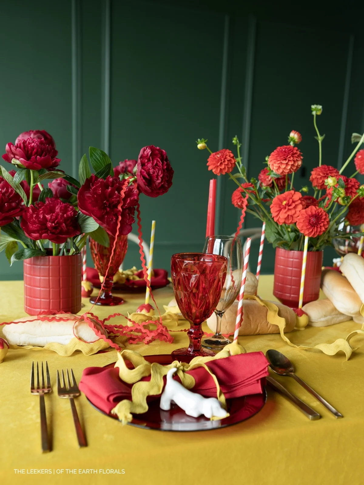
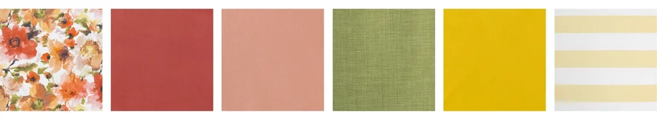
Citrus Squeeze
This palette feels like summer at full saturation. Bright citrus tones, watercolor florals, fern greens, and Riviera-inspired stripes create a table that’s playful yet elegant. Layla Floral brings the punch of color, while Nola Spring Green grounds the look with a bright green, botanical base. The key here is contrast. Orange against green. Mixed sherbet tones accented by tailored umbrella stripes. It shouldn’t perfectly match, but that’s the point.
For a more summer resort look, layer in Cabana Stripe Butter, or weave in solids like Velvet Orange Rose and Monaco Ginger for added warmth and dimension. Halsey Sage and Newbridge could easily be substituted into the linen lineup, keeping the palette and vibe feeling elevated instead of overtly tropical. This is the kind of palette that thrives on pattern play, colorful blooms, striped umbrellas, and tables designed for lingering long after sunset.
Linen Picks: Layla Floral | Velvet Orange Rose | Monaco Ginger | Nola Spring Green | Velvet Marigold | Cabana Stripe Butter
Americana, Elevated
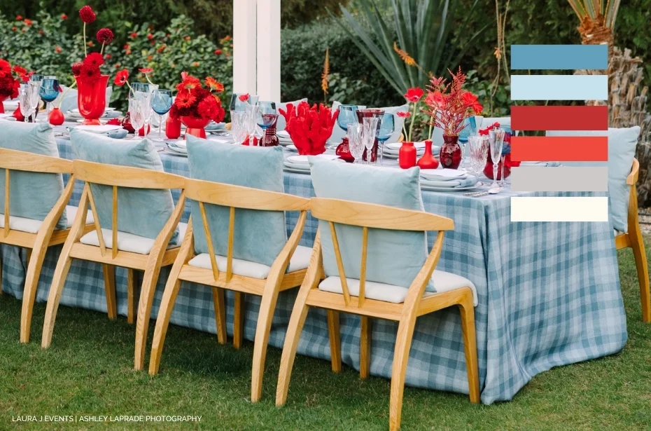
Americana, but less literal. Checkered Plaid Harbor creates a monochromatic blue foundation that feels crisp and nostalgic, while bold red florals break up this patriotic palette in all the right ways.
Wooden chairs and natural textures warm up the cooler tones, keeping the setting from feeling overly polished or overly patriotic. Layer in Nola White for a crisp, upgraded white linen, or weave in Ticking Stripe Cornflower or Davey Coastline Blue for a more relaxed, coastal feel. This palette works because it balances structure with bright pops and is perfect for Fourth of July dinners, Memorial Day weekends, clambakes, and long-table a fresco hosting.
Linen Picks: Checkered Plaid Harbor | Patchwork Seabreeze | Davey Coastline Blue | Ticking Stripe Cornflower | Velvet Ocean | Mila Woven White
Moss & Mirage

Kennedy Stripe Moss sets the tone with a tailored stripe that immediately feels polished, coastal-adjacent, and quietly expensive. But instead of leaning predictable beach house, this palette pivots into richer territory with teal accents, saturated florals, and warm wood tones. Bright fuchsia orchids and orange ranunculus in this look create intentional friction against the earthy green stripe, while bamboo flatware and woven textures soften the contrast. To achieve this look on your own, use Velvet Peacock, Monaco Seafoam for complementary tones, or Monaco Ginger to add a pop to placesettings without fully overpowering the palette. The result feels somewhere between luxury resort, modern tropical, and elevated organic entertaining. Swapping the floral accents can shift the palette entirely — whether you’re going for a more structured approach or keeping things more loose and flowy, this palette is flexible enough to be tailored toward any style event, from tropical to more refined.
Linen Picks: Kennedy Stripe Moss | Pompano Verte | Velvet Deep Sea | Velvet Peacock | Monaco Ginger | Riga Sand
Salt Air & Sandstone
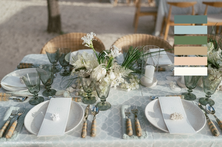
This is coastal entertaining stripped of the nautical clichés. Dusty blues, softened greens, sandy neutrals, woven textures, and layered natural materials create a palette that feels refined rather than themed. Think less anchor motifs, more quiet luxury by the water. Wicker details, colored glassware, woven chairs, and soft linen textures keep the setting relaxed but intentional. The Perfect Linen Napkin with Taupe Stitching or Stonewashed White adds an organic softness, while Lexington Seafoam, Lexington Linen, introduce subtle pattern moments throughout cocktail tables and layered spaces. For extra dimension, bring in textured linens like our crocheted Bohemian overlays (available in White or Sand) and woven accents like the Mari Scallop Natural placemat to create that collected, layered feel summer tables do best.
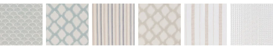
Linen Picks: Lennon Powdered Blue | Lexington Seafoam | Davey Coastline Blue | Lexington Linen | Linea Sand | Bohemian White | Bohemian Sand | The Perfect Linen Napkin with Taupe Stitching
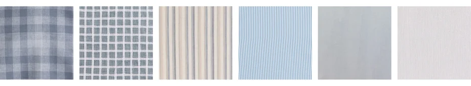
Verdant & Verner
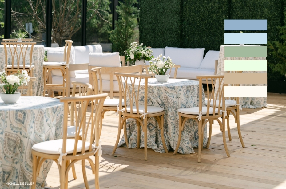
A garden party, but without the typical feminine color pairings. New Verner Leaf mixes watercolor blues, sage greens, and warm neutrals in a way that feels classic, collected, and with a light dose of Southern-inspired charm. It carries movement without chaos and color without overwhelm. Bouclé Powder Blue and Velvet Ocean bring in texture and contrast, while Everly Azure adds a layer of additional softness and embroidery detail into the palette. This is a look that will thrive with more texture. Think pleated placemats, embroidered linens, patterned layers, colored glassware, and warm candlelight against soft blue tones. The overall effect feels coastal-adjacent without being obvious, and leans more estate garden than seaside cottage.
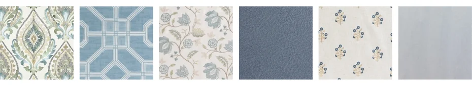
Linen Picks: Verner Leaf | Parterre Rain | Everly Azure | Boucle Powder Blue | Clara Blue | Velvet Ocean
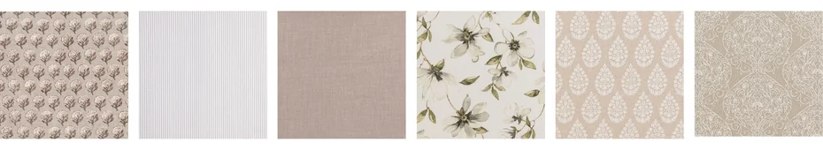
Terra & Thistle
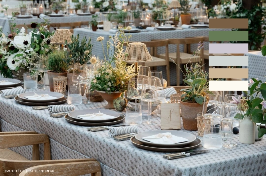
Earth tones take center stage here, but it’s the subtle pattern play that steals the moment. Emelie Dove Grey sets a muted, block-printed foundation layered with olive, sage, clay, taupe, and soft mauve accents. Stoneware, weathered woods, wicker lighting, terracotta vessels, and live greenery create a palette that feels collected over time rather than overly styled. Ticking Stripe Taupe Napkins keeps the setting tailored while still relaxed. The overall look lands somewhere between California wine country, greenhouse dinner party, and elevated alfresco entertaining — earthy, understated, and deeply layered.
Linen Picks: Emelie Dove Grey | Ticking Stripe Taupe | Nola Stone | Magnolia Fog | Maisie Zinc | McKinley Linen
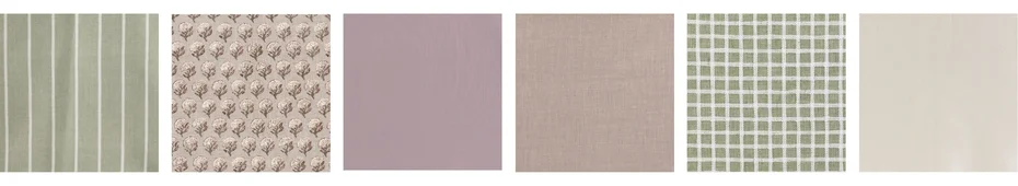
Mauve Market
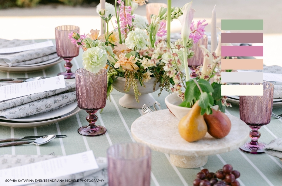
Madeline Aloe brings an easy striped foundation to the table, while Emelie Dove Grey softens the palette through muted mauves, sage greens, and soft neutrals. The beauty of this palette is in the produce. Figs, grapes, pears, berries — the styling itself becomes part of the color story. Purple-toned glassware and florals in faded pinks and soft apricots keep the table feeling layered and romantic. This is the kind of palette that feels especially strong for late summer garden party-inspired entertaining (think showers or morning brunches) when everything starts taking on warmer, earthier tones.
Linen Picks: Madeline Aloe | Emelie Dove Grey | Monaco Woodrose | Nola Stone | Patchwork Moss | Azores
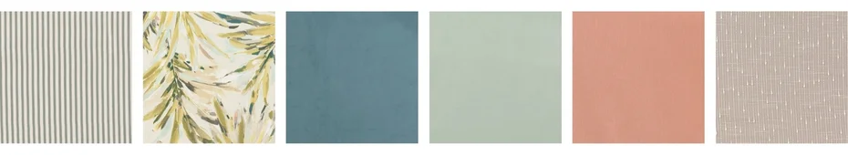
Sunwashed Layers
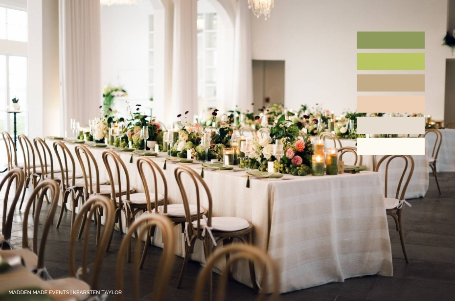
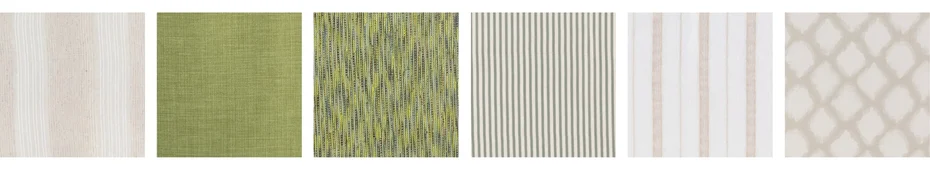
This palette is proof that earth tones can pack a punch. Montauk Sand Overlay creates a warm, dimensional foundation layered while saturated greens, dusty pink florals, olive accents, soft burnt orange tones, and the punchy contrast of Nola Spring Green napkins add drama. The result feels organic and grounded, but still undeniably vibrant. What makes this palette work is the tension and unexpected brightness. Rich greenery against sandy neutrals. Soft florals layered beside sharper citrus-adjacent tones. Texture mixed with color that feels alive rather than overly polished. The overall effect lands as a greenhouse dinner party that’s relaxed, layered, and full of warmth without feeling overly expected.
Linen Picks: Montauk Sand Overlay | Nola Spring Green | Canyon Spring | Kennedy Stripe Moss | Linea Sand | Lexington Linen
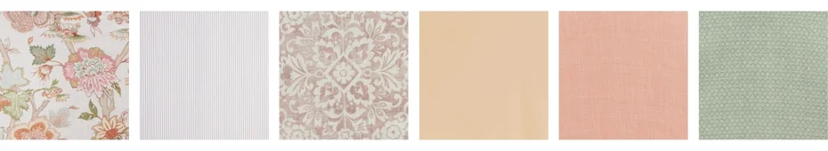
Sherbet Society

Sienna Clay brings all the charm of a classic tapestry print but through a much sunnier lens. Aqua, pink, green, yellow, coral, and warm orange tones create a palette that feels cheerful, layered, and summer-forward. Instead of competing with the print, pair it with adjacent tones or a subtle print: Ticking Stripe Cornflower Napkins (or, opt for a feminine detailed napkin like Sadie Scalloped) pink tinted glassware, green china, soft florals, and tonal layering across neighboring tables. This is the feminine summer table without the saccharine energy: flirty, colorful and polished.
Linen Picks: Sienna Clay | Ticking Stripe Taupe | Westerly Dusty Rose | Monaco Gold | Nola Apricot | Eden Fern
May. 19, 2026