Bold Table Linen Color Combos for 2026 Events
We’re calling it now: bold color palettes are what’s on trend for 2026 weddings and events. While “Cloud Dancer” might be this year’s Pantone Color of the Year (yawn), we’re leaning hard into vibrant hues that make you do a double-take, starting with your table linens.
Your table linens set the tone at your event, anchoring your color palette so everything else, like your florals, table decor and lighting have something to build on. For us, it’s less about how many colors you use in your design and more about how well they play together. Think: a saturated velvet next to something brighter, or a print that doesn’t quite match but somehow works better because of it. The result feels cohesive, unexpected and memorable.
Minimalism can take a backseat this year; we’re going full send on color without overthinking it. Below, a few color pairings that we’re eyeing for the season.
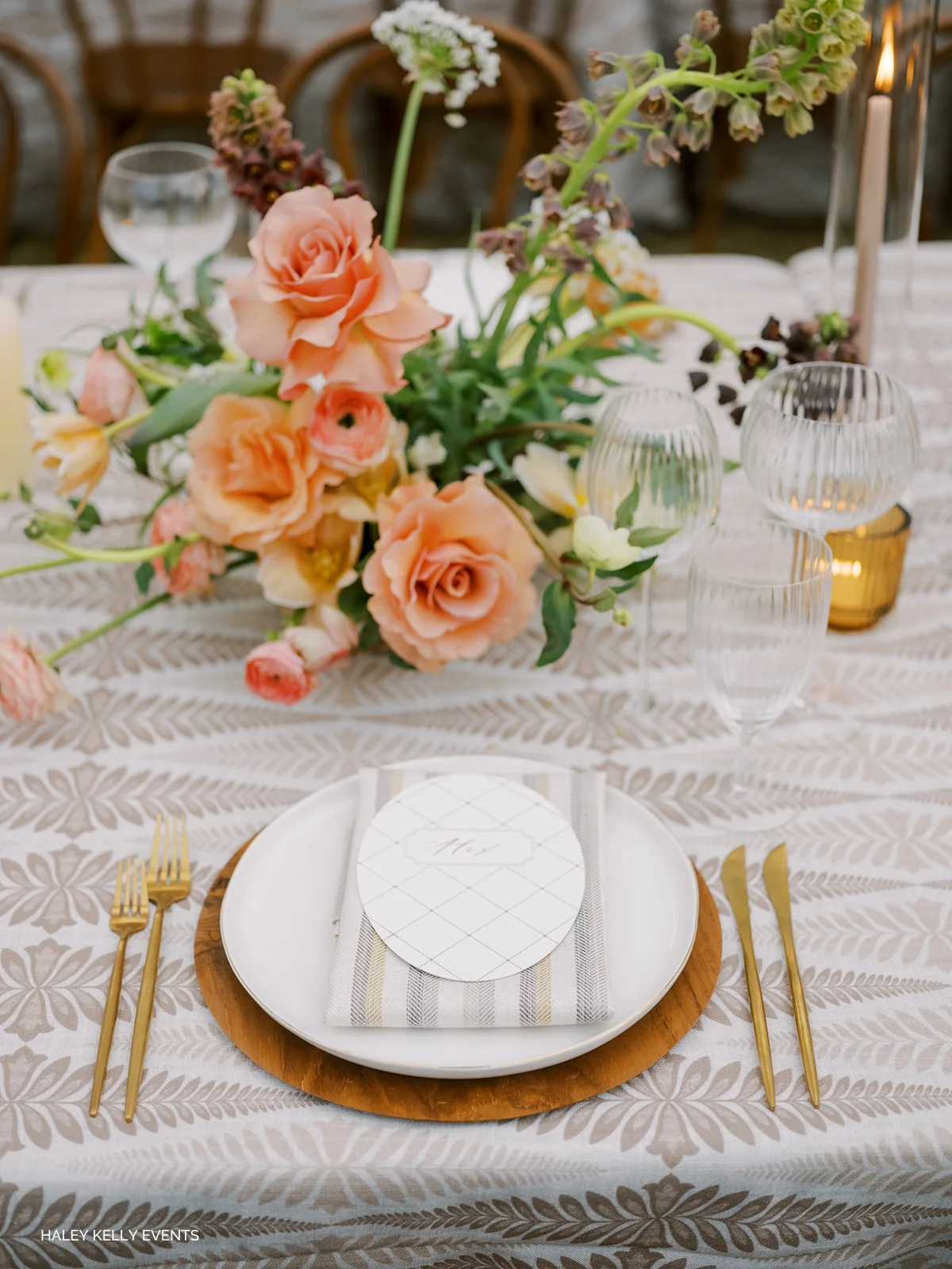
Peach & Cerulean
Peach and cerulean land right between soft and sharp. It’s fresh, a little punchy, and very much summer without trying too hard. Start with a base that gives you some texture, whether that’s a neutral like Gracie Pearl White or a pattern with a bit more personality. Bring in peach through fruit, candles, or florals for that warm, sunlit feel, then layer in a hit of blue like Zara Sapphire to keep it from leaning overly sweet. It ends up bright, balanced, and easy in the way summer tables should be.
Get the Look: Zara Sapphire | Jolie Indigo | Livia Sapphire | Checkered Plaid Harbor | Monaco Ginger | Nola Apricot
Olive & Onyx
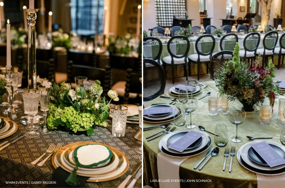
Olive and onyx lean moody, grounded and bold. It’s a palette that feels edgy and modern while still sophisticated and elevated. Start with a rich base linen like Opulent Velvet Lime or Velvet Evergreen to bring depth to the table, then layer in onyx through chairs, flatware, and china to sharpen things up. Bonus points if you choose to mix and match linen colors, think Velvet Black on adjacent tables, or weave in a pattern like Helena Midnight for a more graphic moment. For those wanting a linen that ties the two together, Percival Olive is a top pick with its modern geometric edge.
Keep the rest of the table clean but intentional. Dark glassware, tonal florals, maybe a hint of texture in the chargers or menus. Nothing overly styled, just enough to let the palette carry. The end result feels layered, a little unexpected, and confidently pulled together.
Get the Look: Opulent Velvet Lime | Velvet Evergreen | Helena Midnight | Velvet Black | Percival Olive
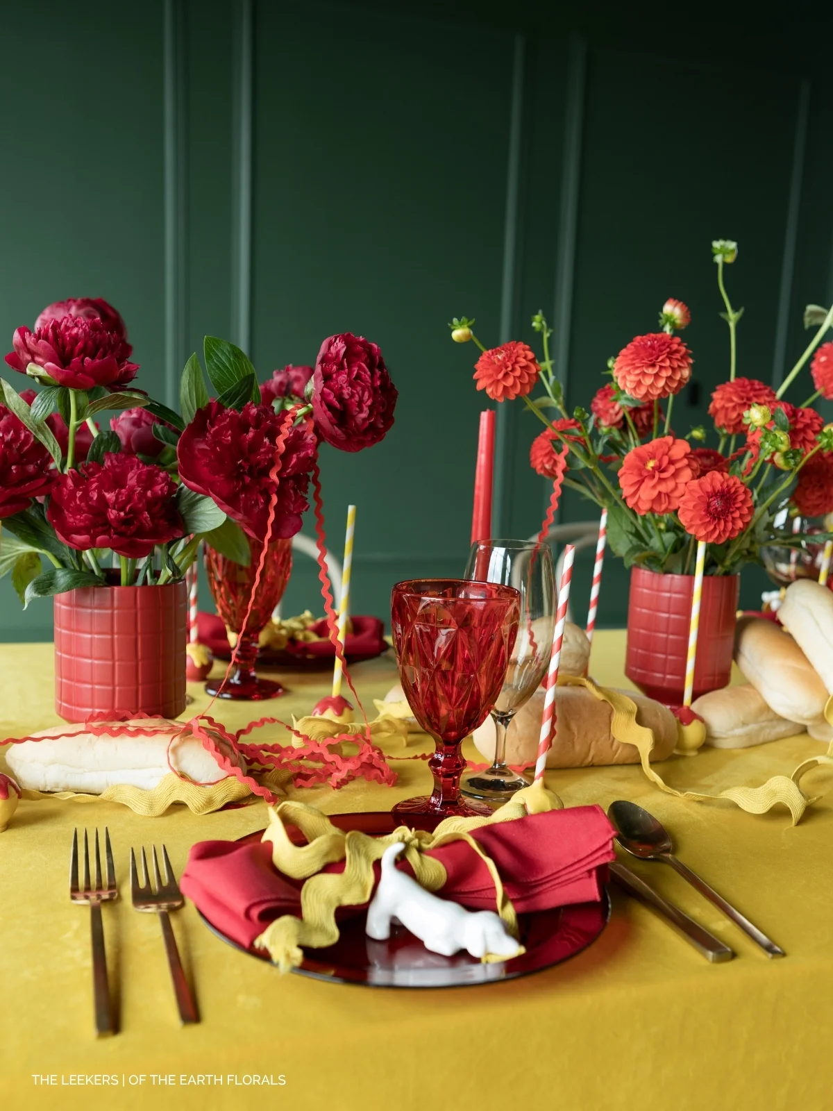
Cherry & Marigold
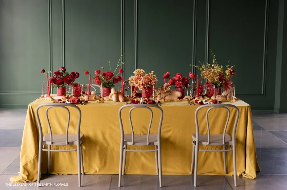
Cherry and marigold lean into pure color: two primaries turned all the way up. Velvet Marigold and Velvet Orange Rose set the foundation, rich and saturated, while cherry-toned accents in glassware and florals cut through with a bright, high-impact finish. It’s warm, vibrant, and created to stand out.
This is not a subtle palette, and that’s the point. It works best when you let the color lead instead of trying to soften it. Think tonal layering across the table, like vibrant florals and even fruit woven into the design, colored glassware and accents to echo the palette. The mix keeps it feeling dimensional rather than flat.
Get the Look: Velvet Marigold | Velvet Orange Rose | Montana Suede Lipstick | Monaco Gold | Maisie Sunshine
Salmon & Butter
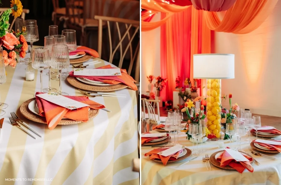
Salmon and butter are summer at full volume. Cabana Stripe Butter sets a bright, sunlit foundation, while Aruba Coral napkins bring in that punchy, citrus-forward warmth. This is where you lean all the way in: layer in lemons, nectarines, colored taper candles, and tinted glassware to build out the palette.
For an alternative linen lineup, choose Maisie Sunshine, Stonewash Yellow napkins, Velvet Orange Rose, Ali Tangerine, or even Penelope Pomegranate for a more glam feel that still reads tropical.
Get the Look: Cabana Stripe Butter | Aruba Coral | Stonewash Yellow | Velvet Marigold | Velvet Orange Rose | Maisie Sunshine | Ali Tangerine
Lilac & Lime
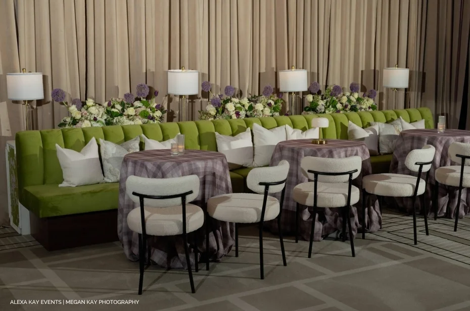
Lilac and lime feel unexpected in the best way: fresh, slightly offbeat, and very ‘in’. Start with Checkered Plaid Elderberry as your base and layer in Nola Spring Green as a napkin (or even pillows on your lounge) for contrast and pattern. Weave in complementary florals like allium or lilacs, as well as accenting table decor like colored goblets or china. For alternative linen picks, choose Gingham Lilac napkins for a softened cottage-core look, or try Newbridge Green paired with Monaco Woodrose.
Get the Look: Checkered Plaid Elderberry | Nola Spring Green | Gingham Lilac | Newbridge Green | Monaco Woodrose
Apr. 21, 2026