

How to Style Your Floral Linens for Fall
Miranda Priestly may have famously dismissed “florals for spring” as anything but groundbreaking, but we’re making the case for something a little less expected: florals for fall.
As summer gives way to autumn, color becomes richer, textures become more layered, and the landscape begins to soften. Floral prints naturally follow suit. Paired with velvets, woven linens, earthy neutrals, and deeper, more nuanced palettes, botanical prints take on an entirely different character, feeling warm, collected and perfectly at home in the season.
Whether you’re designing an intimate vineyard dinner or a grand estate celebration, these are a few of our favorite ways to give florals a second season.
Sienna & Spice
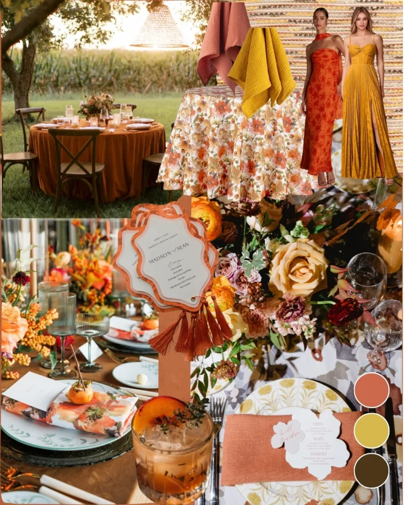
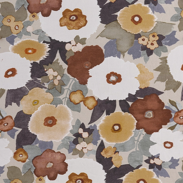
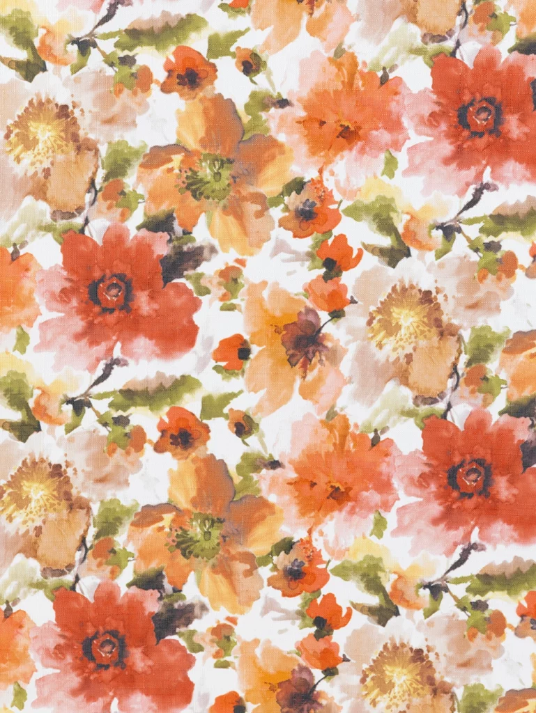
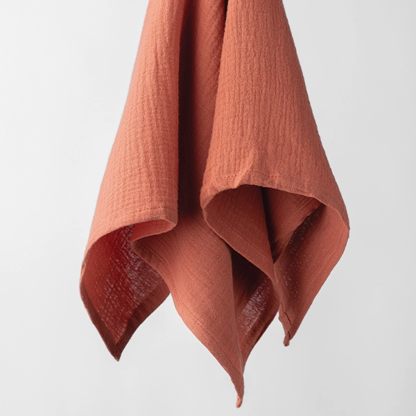
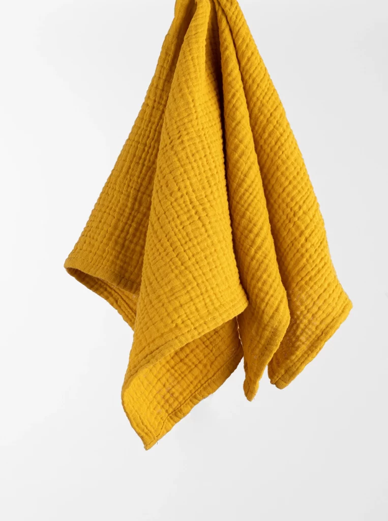
Warm hues of autumn doesn’t have to come from falling leaves. Floral prints like Layla Floral and Denver Chestnut capture the same richness through painterly rusts, marigolds, burnt sienna and spicy tones, creating a palette that feels distinctly seasonal without leaning fully into traditional fall motifs.
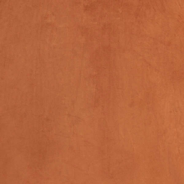
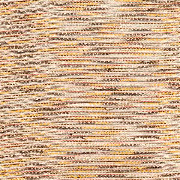
Layer these prints with Velvet Rust, Velvet Marigold, or Velvet Hazel to introduce depth and contrast, or ground the design with the woven texture of Canyon Rust. The interplay between saturated florals and tactile solids creates a tablescape that feels layered rather than themed, allowing each element to complement the next without competing for attention.
This palette feels especially at home among vineyards, winery receptions, mountain estates and tented events where the scenery becomes the backdrop of your design.
Featured Pairings
-

Velvet Rust
Price range: $3.95 through $105.00 -
Denver Chestnut
Price range: $4.25 through $120.00 -
Canyon Rust
Price range: $50.00 through $115.00 -

Layla Floral
Price range: $4.25 through $110.00 -
Velvet Hazel
Price range: $3.95 through $105.00 -

Velvet Marigold
Price range: $3.95 through $98.00 -
Callie Clay Napkin
$3.95 -

Callie Honey Napkin
$3.95



Sage & Saddle
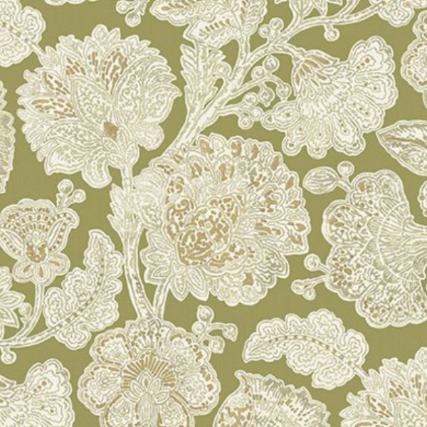
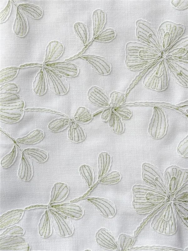
Earthy greens have a remarkable ability to carry from one season to the next. Styled with rich chocolate browns, warm golden accents, and natural textures, they become an elegant alternative to more expected autumn palettes.
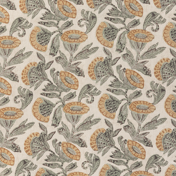
Begin with Halsey Sage or the folksy charm of Nora Celadon, then anchor the design with the richness of Café Noir Velvet. A thoughtful layer of Velvet Marigold introduces warmth while enhancing the organic character of the palette. The combination feels grounded and inviting, balancing softness with depth in a way that reflects the changing landscape of early fall.
Perfect for countryside estates, elevated barn weddings, private residences, and garden celebrations, this palette embraces the season without relying on predictable oranges and reds.
Featured Pairings
-
Halsey Sage
Price range: $4.25 through $115.00 -
Cafe Noir Velvet
Price range: $3.95 through $105.00 -
Nora Celadon
Price range: $4.25 through $115.00 -
Velvet Marigold
Price range: $3.95 through $98.00 -
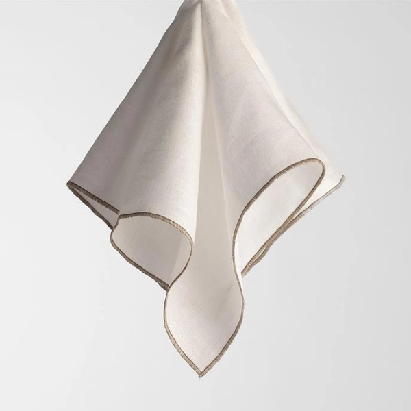
The Perfect Linen Napkin (Taupe Stitching)
$4.25 -

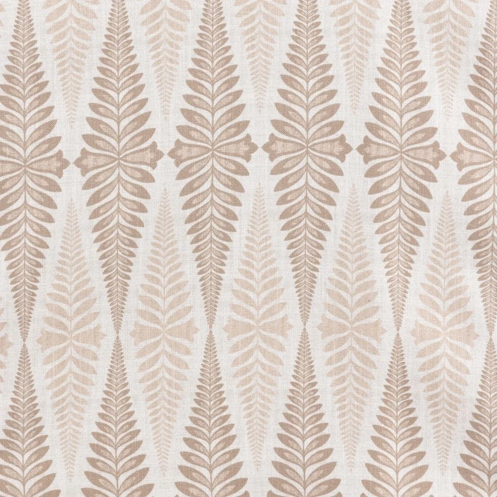
Jolie Wheat
Price range: $68.25 through $103.00 -
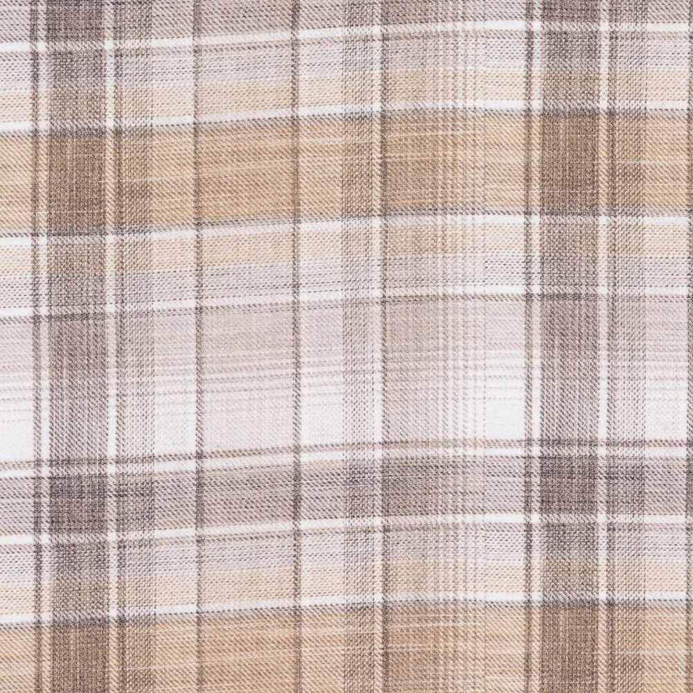
Weston Wheat Plaid
Price range: $4.25 through $103.00 -
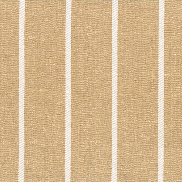
Madeline Marigold
Price range: $4.25 through $115.00


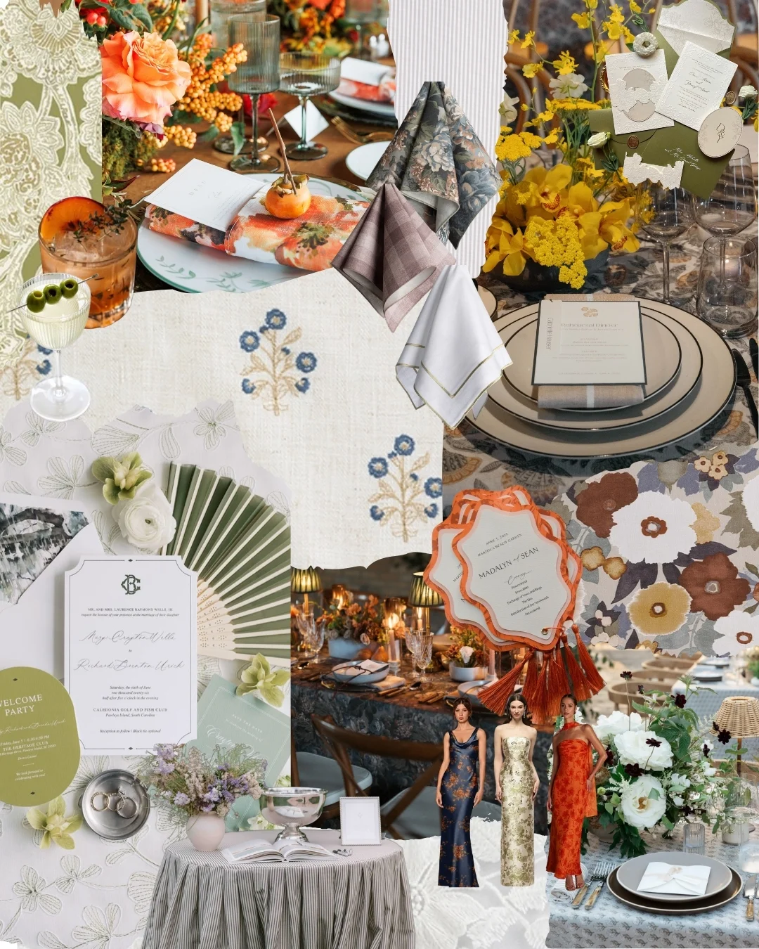
Indigo & Hazel
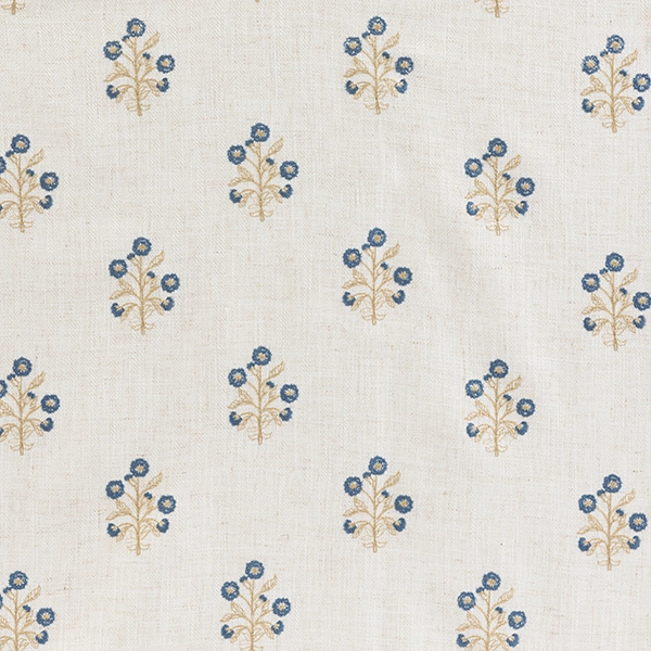
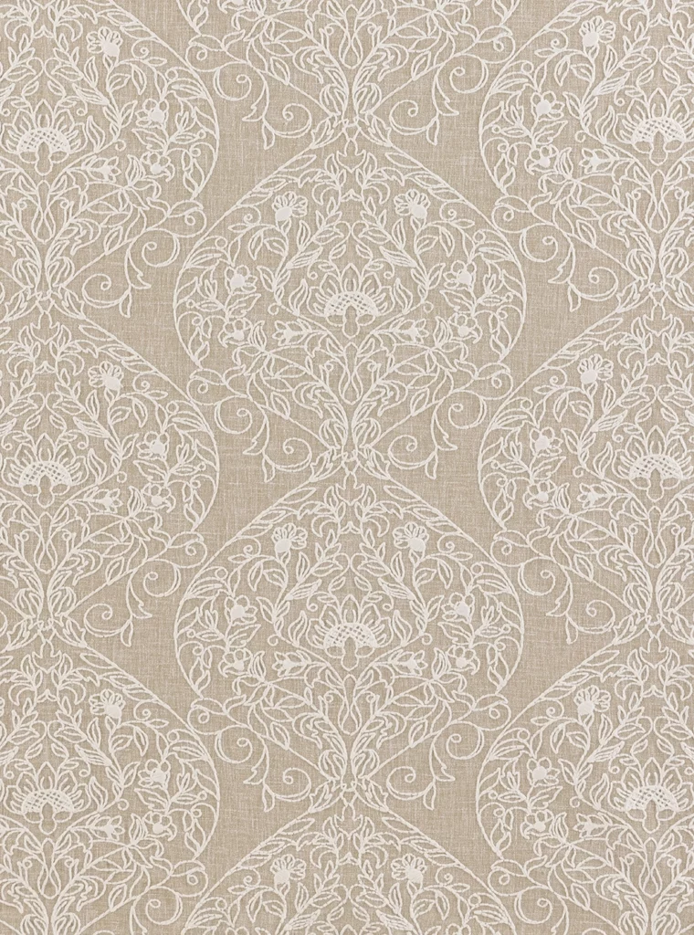
Deep blue has an enduring quality that feels equally appropriate for summer evenings and crisp autumn celebrations. When paired with warm hazel, flax, and copper toned accents, the palette shifts effortlessly into fall, creating a look that is timeless, layered, and quietly refined.
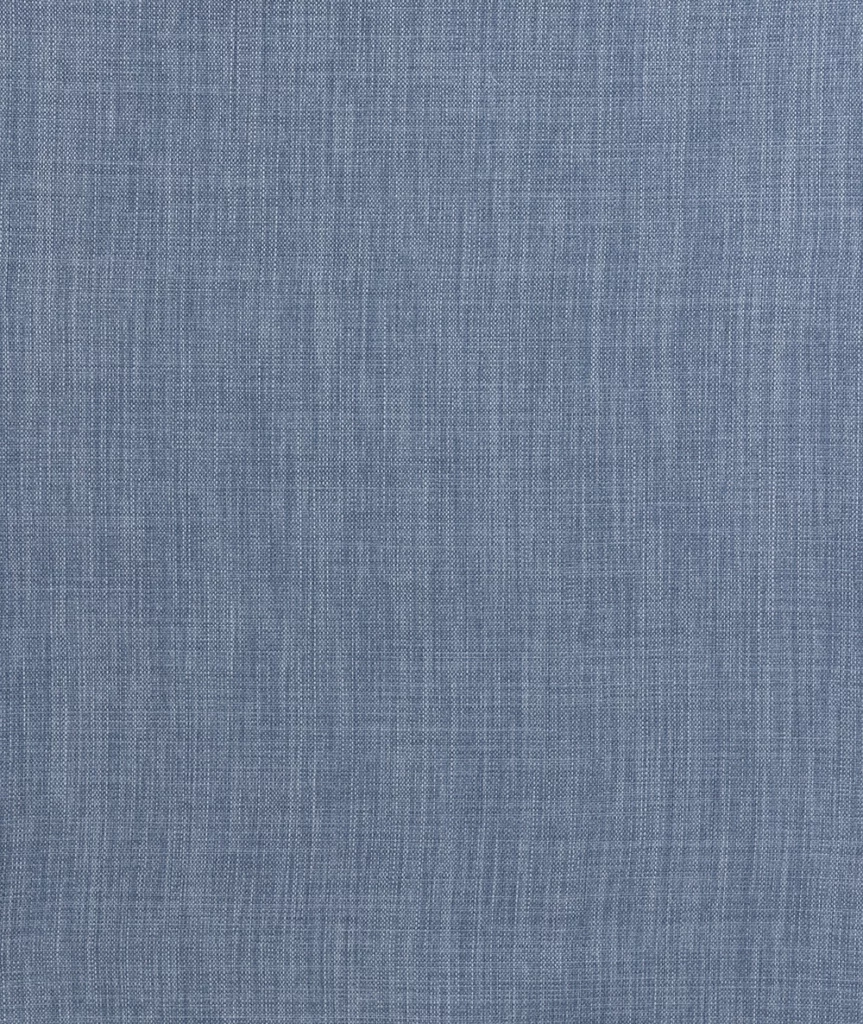
The tailored lines of Rustic Midnight Plaid provide a sophisticated foundation, while Adelaide Indigo introduces a softer botanical element through painterly florals. Velvet Hazel enriches the palette with warm cinnamon and toasted hazelnut tones, balancing the coolness of navy with an inviting sense of warmth. Textured foundations like Clara Blue and Morgan Natural add subtle dimension, while Nola Mystic Blue reinforces the palette with its woven denim inspired texture, lending a relaxed elegance that never feels overly formal.
The result is a color story that feels equally at home along the coast, inside a historic estate, beneath a sailcloth tent, or within the timeless architecture of a private club. It is proof that blue remains one of fall’s most versatile neutrals when layered with warmth and texture.
Featured Pairings
-
Clara Blue
Price range: $4.25 through $120.00 -
Adelaide Indigo
Price range: $4.25 through $115.00 -
Rustic Midnight Plaid
Price range: $4.25 through $115.00 -

Nola Mystic Blue
Price range: $3.25 through $85.00 -
Velvet Rust
Price range: $3.95 through $105.00 -
Morgan Natural
Price range: $4.25 through $115.00 -
Velvet Hazel
Price range: $3.95 through $105.00 -
Weston Wheat Plaid
Price range: $4.25 through $103.00



Mauve & Meadow
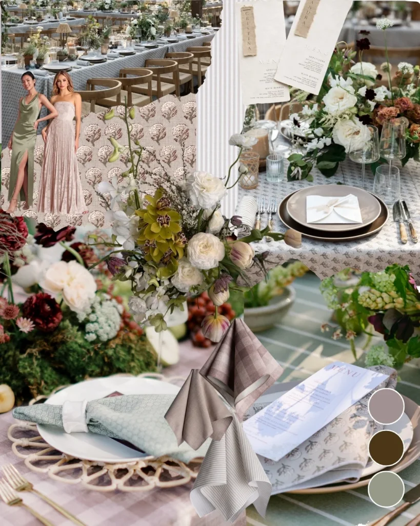
Autumn palettes don’t always have to be bold. Some of the most memorable designs embrace quieter colors that echo the softened landscape of late season gardens, where fading blooms, weathered stone, and natural grasses create their own kind of beauty.
Begin with Checkered Plaid Elderberry, then weave in botanical greens through Eden Fern or Madeline Aloe. The understated texture of Nola Stone provides balance, allowing patterned linens to shine without overwhelming the table. Finally, Monaco Woodrose introduces a muted mauve that reflects the subtle transition between summer and fall, bringing warmth without overpowering the overall palette.
This combination feels especially suited to greenhouse weddings, European inspired estates, conservatories, and intimate garden celebrations where layered textures and restrained color tell a more thoughtful design story.
Featured Pairings
-
Checkered Plaid Elderberry
Price range: $4.25 through $115.00 -
Madeline Aloe
Price range: $4.25 through $115.00 -
Eden Fern
Price range: $4.25 through $115.00 -
Nola Stone
Price range: $3.25 through $79.00 -
Monaco Woodrose
Price range: $3.25 through $85.00 -
Emilie Dove Grey
Price range: $4.25 through $115.00 -
Ticking Stripe Taupe
Price range: $4.25 through $97.75 -
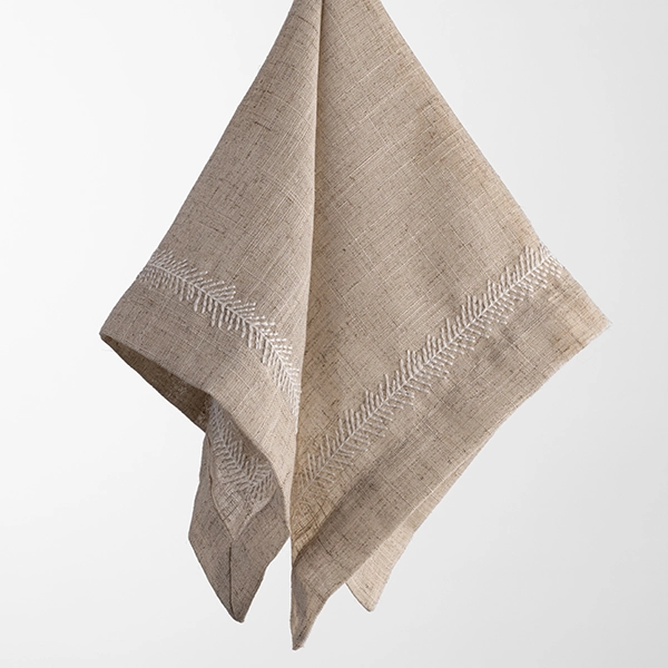
The Perfect Linen Napkin (Taupe Stitching)
$4.25





Fern & Flax
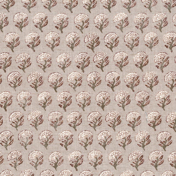
Fresh greens need not be reserved for spring. When paired with natural linens, warm taupes, and woven textures, they become softer, richer, and remarkably appropriate for autumn entertaining.
Begin with McKinley Linen as a natural foundation, then layer in Ticking Stripe Taupe for tailored structure and Riga Sand for subtle texture. Emilie Dove Grey bridges crisp whites with warm flax tones, creating a palette that feels light yet grounded. Rather than relying on contrast, this approach celebrates restraint, allowing seasonal florals and natural foliage to become the focal point of the table.
Ideal for orchard weddings, botanical gardens, tented dinners, and private outdoor gatherings, this palette embraces the quieter side of fall through texture, balance, and thoughtful layering.
Featured Pairings
-

Lisete Sage
Price range: $55.00 through $120.00 -
Ticking Stripe Taupe
Price range: $4.25 through $97.75 -

McKinley Linen
Price range: $55.00 through $115.00 -

Magnolia Fog
Price range: $4.25 through $115.00 -

Velvet Evergreen
Price range: $3.95 through $105.00 -
Lessing Green Stitch Napkin
$4.25 -
Flax Vines Napkin
$4.25 -
Leaflet Olive
Price range: $4.25 through $115.00



Jul. 21, 2026